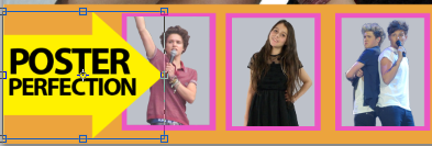
After seeing this ‘We Love Pop’ magazine cover, I decided to
make a section on my front cover advertising free posters inside the magazine.
I used the same idea as ‘We Love Pop’ with the arrow pointing to the posters as
I think it can catch the reader’s eye.

First I used the shape tool in Photoshop to create an arrow,
I chose the colour yellow as it stands out from the colours I have used on my
cover so far, attracting the reader’s attention.
I then put a yellow square over the arrow to make it wider,
and then added ‘POSTER PERFECTION.’ I used the same phrase as I thought it was
catchy and fun.


I then added this to my cover, alongside three posters of
different artists and bands that I have took and added a pink border around
them to fit the house style of the magazine.
No comments:
Post a Comment