Friday, 30 January 2015

Final Review

This is the final version of my review:
 
 
What I've Changed:
  • I have added the photo in place of the blank box. I like the image because it doesn't give too much away, though this doesn't really matter because the review does anywhere, but you can see that the film is clearly going to be about a couple.
  • I have rearranged the synopsis at the bottom just to make it fit the shape of the box more than it previously did.
  • As well as this I have also made some slight changes to my review after getting some feedback from my teacher. You can see this in a previous post.

Final Poster

This is the final version of my poster:
 

What I've Changed:
  • I have changed the photo to a photo I took this weekend when shooting the short.
  • I have moved the reviews down slightly more so they don't cover Joe too much.
  • I have moved the title/strapline so they don't cover Joe's face.
  • I have changed the colouring of the photo of me so the difference between the two images aren't as dramatic which they originally were due to the difference in lighting.

Monday, 26 January 2015

Photos

While filming this weekend, Jayme and I took some photos to use on our reviews and poster. Here are my photos:

I think these two photos are taken two far away, a medium-close up shot would probably be better than a long shot. You can't see Joe's face.


I like the shot type of this photo. The space on the left hand side leaves space for the photo of the woman. The fact he is looking to the left also adds to this because when the other photo is layered over top, it will look like he is looking at her.


I like this shot for the review. The couple holding hands shows the film is a romance; it's a typical shot for the romance genre. However, the first shot cuts of Joe's head and has people in the background but I like the second photo and think it will work well.


Friday, 16 January 2015

Film Poster Part 6


Apart from the background image, which I will most likely change to a lighter photo, but will be a similar photo of James in the background, this is my finished poster. I have included all the logos of the companies/film festivals involved as well as adding the catch line to the poster, under the title.

Film Poster Part 5

I have changed my poster a lot since yesterday as I was having trouble choosing a background to use.
 

  • I have changed all of the details from the poster to opposite sides.
  • I have added a blurred photo of James in the background. However, I haven't decided if this photo that is going to stay as I think it is too dark for the poster. I might take some still shots when shooting the final scenes to use as the background. I have just used this photo as an idea.
  • I have changed all the font to white to make sure it can be seen on the poster.
  • I have started to had some logos of brands that could have been associated with the short film, for example Film 4. Here I will also be including the film festival award/logo here.


Review Part 4

This is the final draft of my review, apart from the fact that it doesn't include an image. The image will be taken when filming the final scenes as I will take along a stills camera with us to take the photo.


I have expanded my review to make it fit the columns fully. As well as this, I have been able to get the text to wrap around the red circle by making the circle in Photoshop and saving it as a JPEG. This got around the problem I was having of the text in the circle wrapping instead of the large blocks of text wrapping.


I have added the names of the director and editor etc. to the credits at the bottom after discussing with Jayme the names we would use. 

Thursday, 15 January 2015

Film Poster Part 4

  • I have created the credits that will be found at the bottom of my posters. I used the font SF Movie Poster from 1001fonts.com and edited them together on Photoshop. The credits include the producers, director, stars, editor, director of photography and music.
  • I have added the credits to the bottom left hand corner of the poster.
  • I have added a background, which I got the colour of by using the eyedropper tool on the £5 note to get a similar colour. However, I do not like this background and will be attempting to find a new background to change it too, but for now, I will use this.

Wednesday, 14 January 2015

Film Poster Part 3

 
  • Here I have changed the font of the title to the font Jayme and I chose together.
  • I have added these images at the bottom that credit the film for being involved with film festivals. I have seen these on various short film posters such as Colours, the one I took these from:


Tuesday, 13 January 2015

Poster Title 2

This is the font Jayme and I have decided to use for the title on our film posters. It is from 1001fonts.com


Monday, 12 January 2015

Film Poster Part 2

This is my short film poster so far.


  • I have justified my image to the right hand side to allow space for information and title as originally I had the image in the centre, taking up most of the page, but there was no space for the title and other information. This is what it looked like at first:

  • I have changed the font of the title again as I am still not sure what font I like best, and what font I think fits the poster more. I am going to keep changing the font throughout the process of making my poster until I find a one I want to keep. I also need to look at fonts with Jayme so we can choose a font together. All fonts are from 1001fonts.com
  • I have added information to the poster such as the name of the director and the star actor as well as adding reviews from magazines of the short. These should hopefully convince people to watch the film.
  • I have started to create some credits for the film at the bottom. I am busy looking for the right fonts that will make the credits look like credits from professional film posters.

Saturday, 10 January 2015

Review Extension

After changing the size of my font on my review I realised that I had not written enough to fill the space so I have extended it. I have been reading many reviews to try and find ideas of what to write in it. This is my finished review.

Thursday, 8 January 2015

Film Poster Part 1

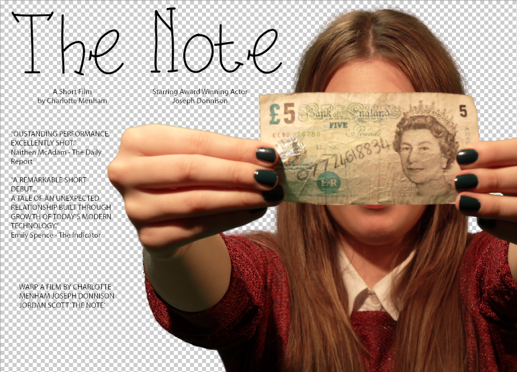
First I have started to edit the photo.
 
Before:
 
 
After:
 
 
  • I took way the background the make it transparent.
  • Changed the colour of the photo to make it look more natural as the lightning when taking the photo made me look more yellow.
  • I have changed the colour of the area under my arm as it looked quite green due to the reflection of the green screen. To do this I used the Eyedropper tool to pick a similar colour of skin from around the area and then used the Brush Tool to paint over the arm.
  • I deleted any unnecessary details around the edge for example the hair hanging down under my arm or the straps off my bracelet.

Poster Title

I have been looking for fonts to use as the masthead for my poster. Since the film revolves around the idea of someone writing their number on a £5 note, I wanted the title be a handwriting style font. This is the one I've chose to use at the minute, however, this may change.

Wednesday, 7 January 2015

Poster Photos


Today, I took some photos that I may want to use as the photo for my poster. My main idea for my poster is to have Jennifer (me) holding up the £5 note with her number on to her camera, covering her face, or most of her face. I like this idea as Jennifer isn't revealed until the end of the short film and this way it still keeps her a mystery even in the poster, it doesn't spoil anything.

Here are the photos I took today:


This is the one I am using:

 
I like this photo because it covers the woman's face which is what I wanted to do seeing as you don't find out who the woman is until the end of the film: it doesn't spoil the mystery. As well as this the £5 note is situated in the centre and is a key feature to poster which I like as this is the object that controls the narrative.